

10 Epidemiological Charts for Historic Diseases and their Vaccines
10 Epidemiological Charts for Historic Diseases and their Vaccines

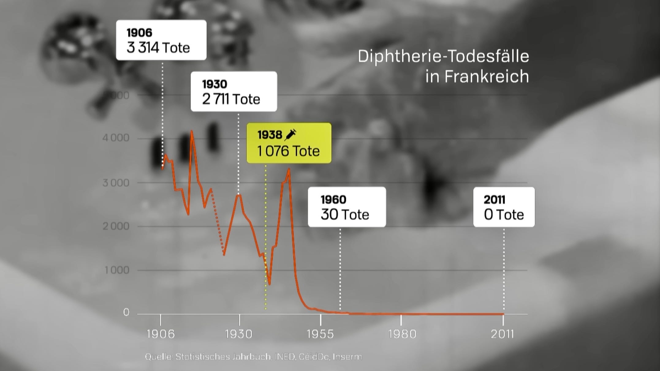
Diphtheria - Start of vaccination 1938 against diphtheria in France is followed by an immediate spike in deaths, then return to pre-vaccination trend. (“Tote” & “Todesfälle” => “Deaths”)
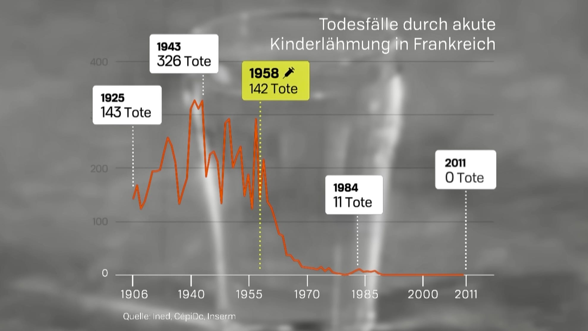
Acute Poliomyelitis (Polio) - Small spike after vaccination start in 1958, then sudden drop.
Measles - Vaccine introduced in 1983, long after deaths have been very low already. No clear change of pre-vaccination trend.
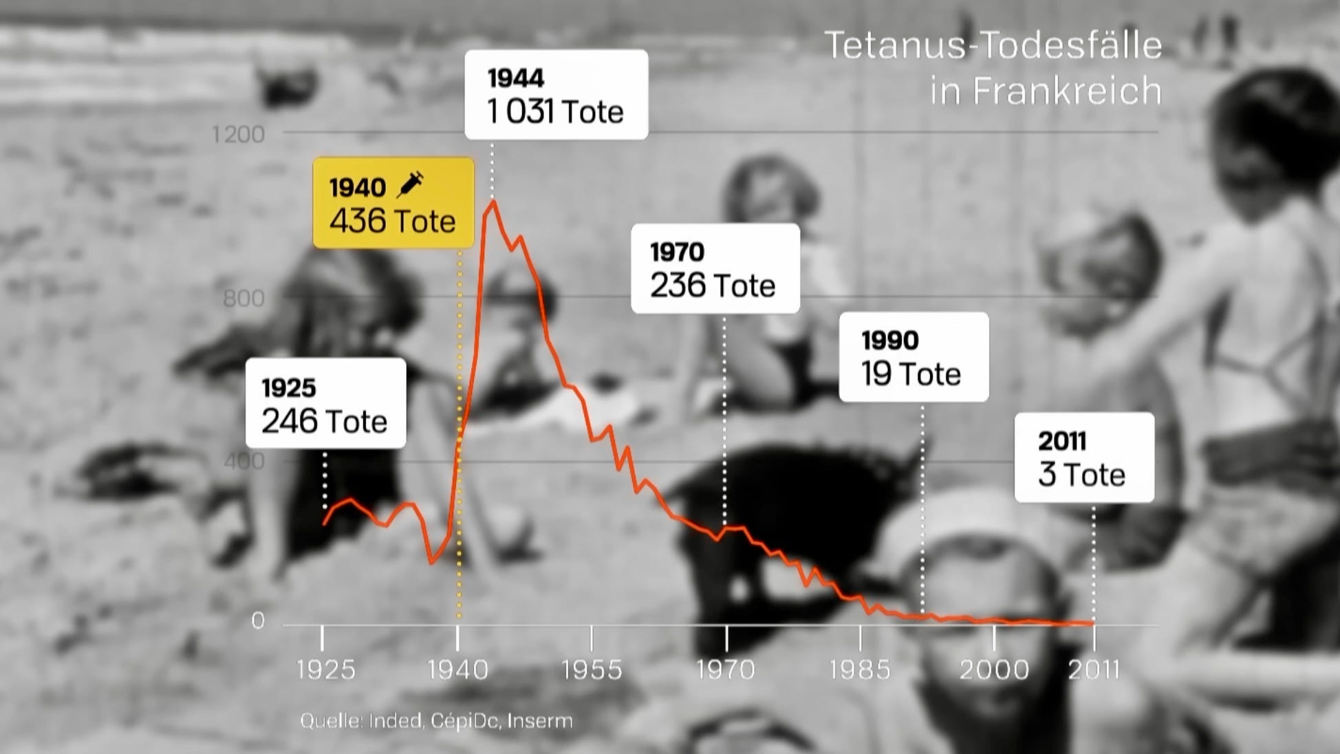
Tetanus - Huge spike after the vaccine was introduced in 1940. Then drop to almost 0 around 2000.
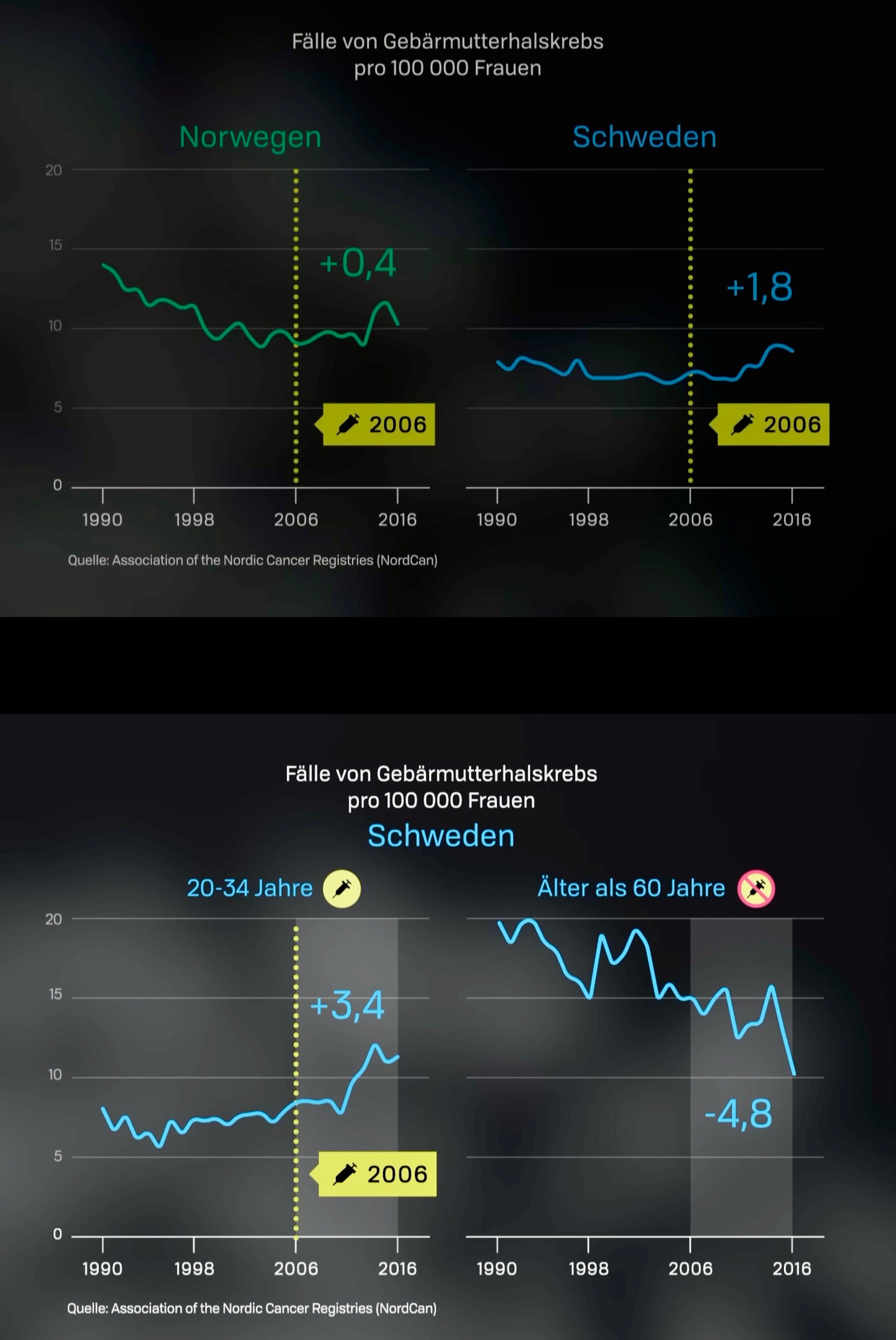
Human papillomavirus (HPV) - increase in cervical cancer incidence after vaccination start in 2006, not seen in unvaccinated age groups and countries with low vaccination rates.

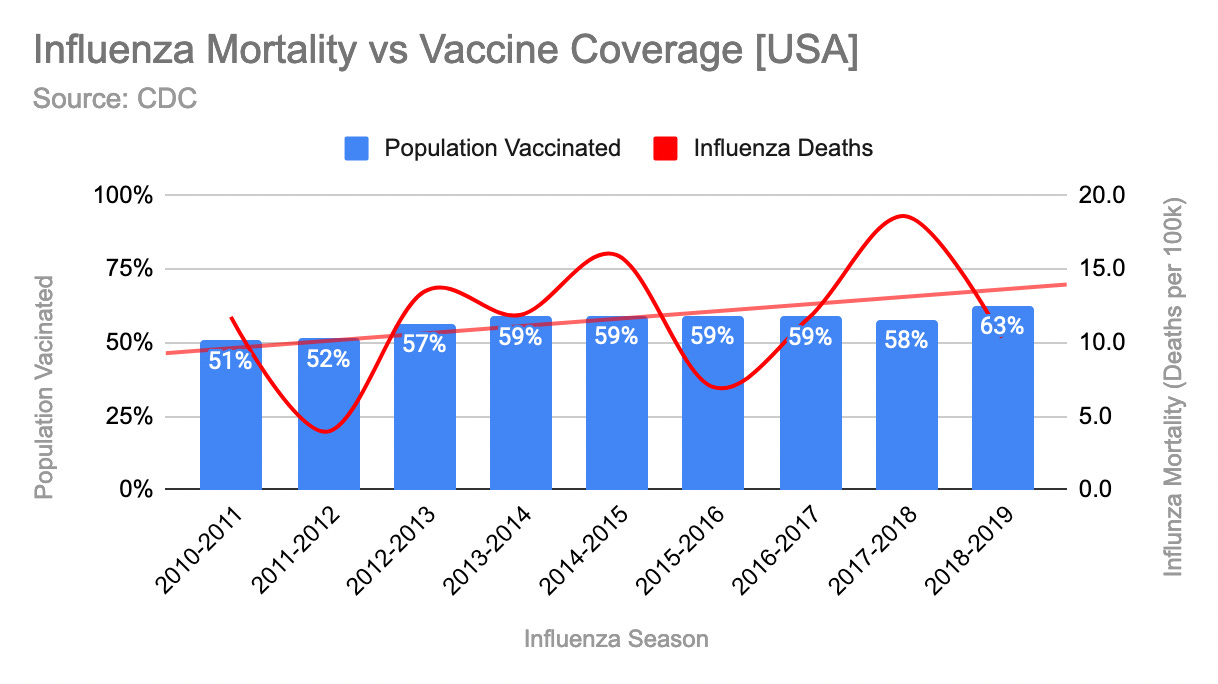
Influenza - Population vaccine coverage of the yearly influenza vaccine in the USA increased from 51% in season 2010/’11 to 63% in 2018/’19. Influenza deaths also increased from under 10 deaths per 100,000 to almost 15/100k according to CDC’s calculations.
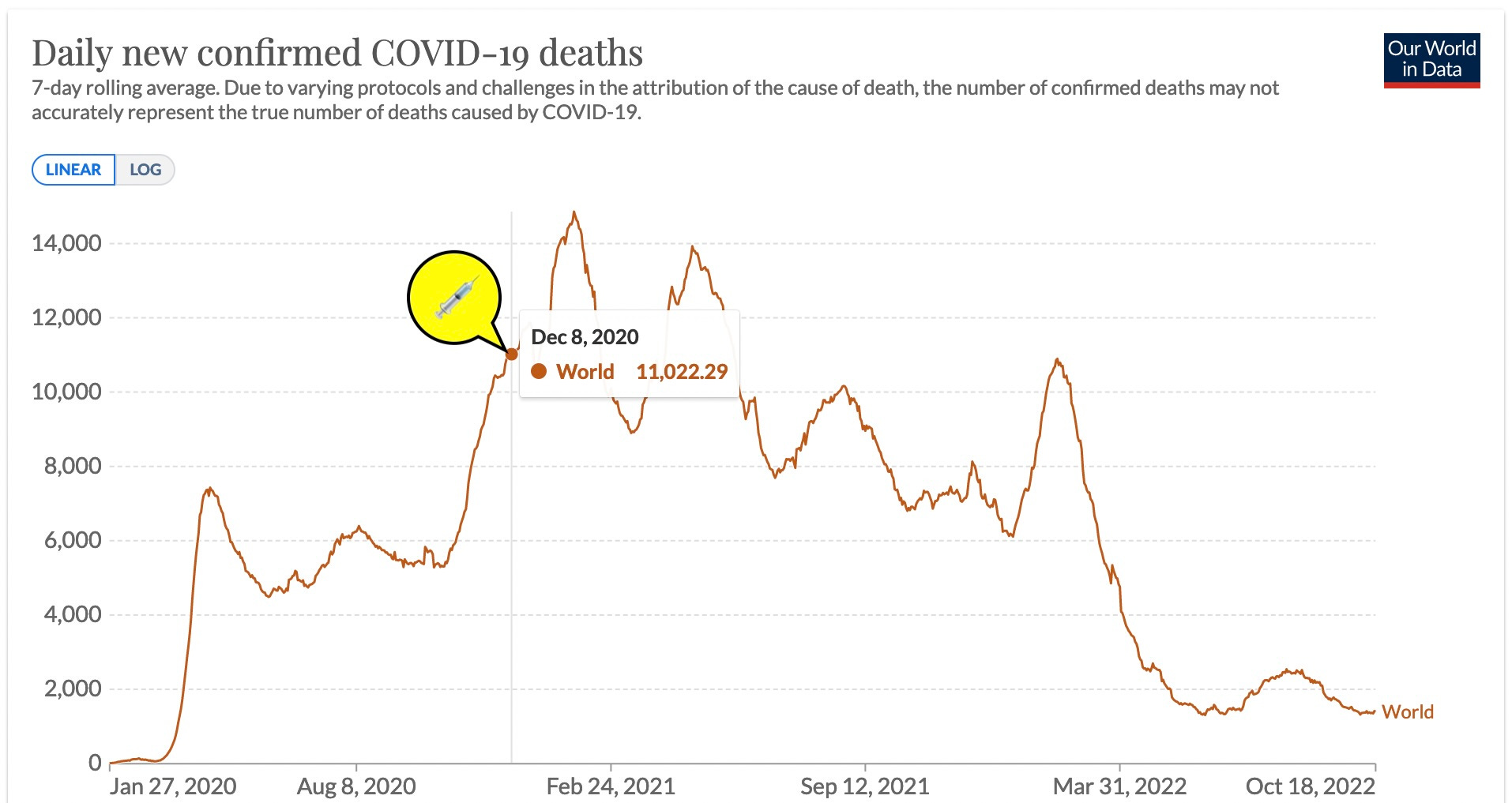
COVID-19 - After vaccination started on 12/8/2020 in the UK, and days later in the the rest oft the world, COVID-19 attributed deaths first increased, then remained high for over a year, to then sharply decline with the Omicron variant.
In all these charts, it remains unclear how the curves would have looked like without vaccination, but except maybe in the case of polio the effectiveness of the vaccines should clearly be up for debate.
Especially when we are looking at other statistics, which show interesting correlations, such as all-cause mortality.
All-Cause Excess Mortality - Since the start of vaccination, excess deaths from all-causes in most countries have doubled or tripled further.

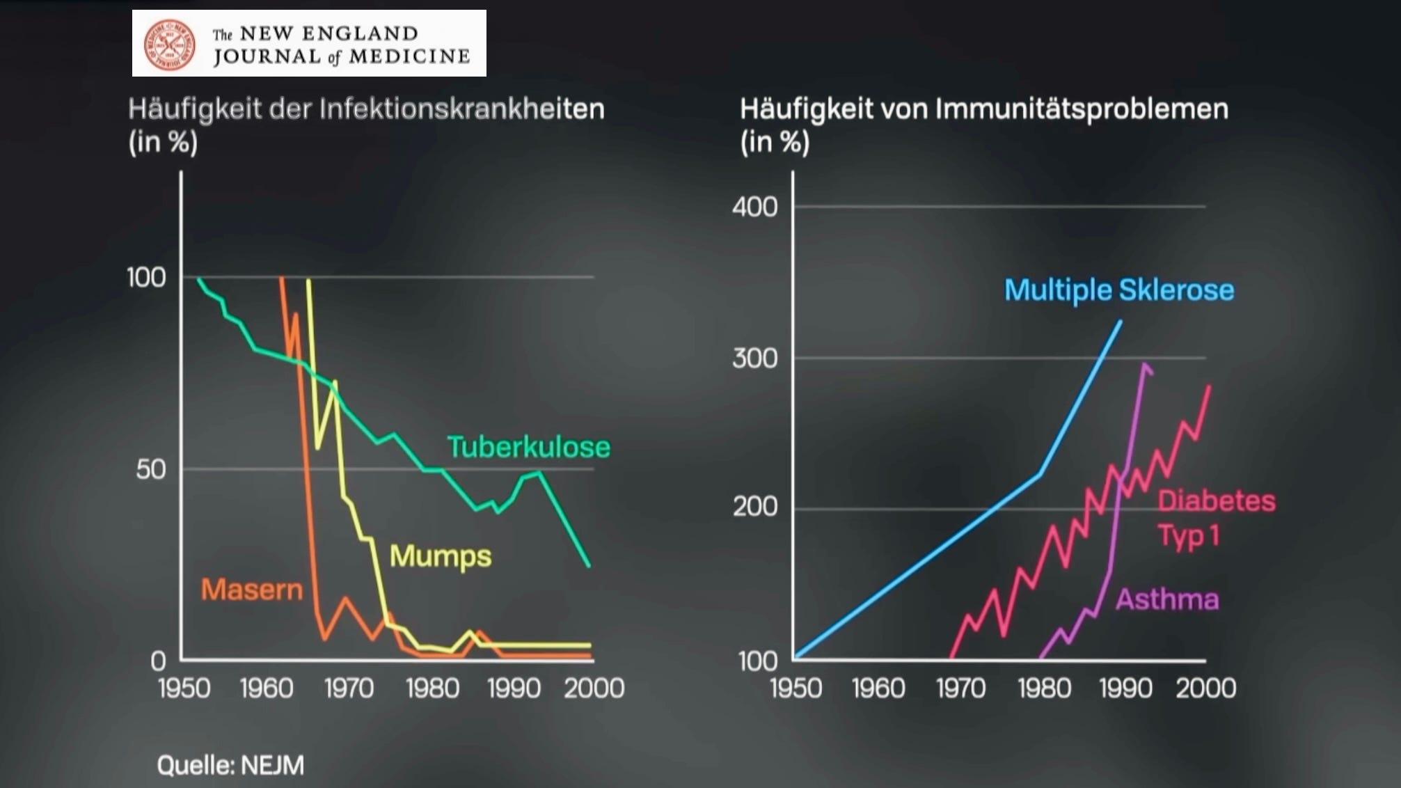
There are also other forms of diseases which seem to appear with an inverse relationship to the disappearing infectious diseases, such as multiple sclerosis, type 1 diabetes, asthma and allergies.
10. Hepatitis - Diseases of the liver which are caused by a virus according to CDC. Since the introduction of the HepA and HepB vaccines in 1981, and 1995 respectively, deaths by hepatitis have increased 5x!
After introduction of the Hepatitis A vaccine, deaths from that virus decreased, but deaths from this type are relatively low compared to the other variants.
After the introduction of the Hepatitis B vaccine in 1981, deaths increased to almost 3x rate for this type.
We can also observe that other forms of hepatitis (not A/B) were steeply on the rise since the 1990’s, despite vaccination against the A/B variants.

Sources:
Most charts are from the German documentary “Impfen” by ARTE:
https://ourworldindata.org/explorers/coronavirus-data-explorer
https://docs.google.com/spreadsheets/d/1ZuYPyCv2pSmElrBBOi9-UUiIec9Pbg7Img_Qzk0CLOg
https://docs.google.com/spreadsheets/d/1eAC0wHhz2wjsYCsHsWRsnxnXTjdHYTcISM1h-fLPd0o/edit#gid=0
Thanks for reading and let me know what you think in the comments!
Excellent summary, Ben! Will share now...
Wonderful collection of impactful charts and special thanks for #9 for chronic illness which is never shown graphically. My roots are in the gmo food arena.. can't count the hours hunting for trend data charts in illness & therapeutic revenue to compare to Rockefeller - Gates gmo crops.. fun chart to toss in the mix since we have been part of their feeding experiment, population wide since 1997... food for thought or thought for food :~)
HT- Herbicide Tolerant
Bt - plant produces its own pesticide & every cell toxic.. works by eating through the soft stomach tissue of corn boers.. betcha a nickle a steady diet does more than acid reflux in humans
Stacked is Bt + HT = over 90% gmo varieties grown
https://web.archive.org/web/20220623213618/https://www.ers.usda.gov/data-products/adoption-of-genetically-engineered-crops-in-the-us/recent-trends-in-ge-adoption/